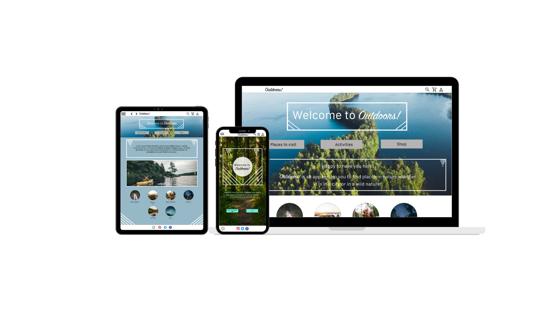
Outdoors!
Branding / Product / Ux / Ui Design / May - June 2022
This project was for my last Google’s Online Course at Coursera. The objective of the course was to learn UX design by using a mobile first -method. I completed this project in two months, and learned more from Adobe XD (wireframing, research, analyse and prototyping).
Tools used: Adobe XD, Canva, Miro, pen and paper. You can test the prototype here.

Introduction
The project goal was to learn about a Mobile First-method from scratch. My idea was to create an informative app and responsive website to consumers.
What is Outdoors?
The app is for people who want to go out to nature in a city or wild. Outdoors! is the app that helps people to find ways to enjoy in nature. Typical user is 30-60 years old. The goal is to make it easier to explore in nature.
Responsibilities
Conducting remote interviews, paper and digital wireframing, low and high-fidelity prototyping, conducting usability studies, accounting for accessibility, iterating on designs and mobile-first design.
User research: summary
I conducted unmoderated research and created personas to understand the users I’m designing for and their needs. A primary user group identified through research was working adults or elderly who want to have find new ways to explore nature.
This user group confirmed assumptions about Outdoors! users, that they want to go to a forest and see water (lakes or sea). Other user problems included frustration or challenges that users want to relax in nature and also updated guidance.
I also did audition to check competitors in Finland. There are not really competitors who work in the same way, but in the field is Metsähallitus (Luontoon.fi).
Sketching
I love sketching and drawing with a pen. I tested paper wireframes and then started to create digital ones.
Affinity mapping
In my ideation process, I used sticky notes repeatedly to organize my findings and ideas. I used sticky notes in Miro for mapping potential user flows and Customer journey maps. Key pain points were: usability and product selection.
Digital wireframing with usability studies
I included for additional screen sizes in my mockups based on my earlier wireframes. I created alongside with a smartphone / ipad / website versions.
Low-fidelity prototype smartphone / iPad / website.
Before usability studies and after usability studies. I removed hamburger icon and changed left cursor’s place. I added to a cart view a “map trip1” which user has chosen.
Digital wireframing
I included for additional screen sizes in my mockups based on my earlier wirefr.ames. I created alongside with website a smartphone version too wirefr.ames. I created alongside with website a smartphone version too
From low-fidelity to high-fidelity prototype.
After usability studies users wanted two different view options.
Takeaways
Impact:
I believe this app and responsive website could be useful in Finland. I created “a Nature calendar” idea, which I’m really happy and I wish users would use it.
“Nature calendar is a really good idea!” – Facebook friend.
“The whole look is ‘fresh’!” - Facebook friend.
What I learned:
There are lots of similarities with service design, so it is easy to adapt information and transform it in to new things. I learnt more to use Adobe XD and that always make in the beginning your assets panel, you save whole lot of time.
Mobile-First design
I included for additional screen sizes in my mockups based on my earlier wireframes. I created alongside with smartphone / iPad / website version too.


